↑ Top
Project Summary
Fixing a wicked problem
Our group was tasked with selecting a topic from four categories: Education, Travel, Commerce, or Government. After meeting to discuss our options, we decided on GOVERNMENT and explored ideas around connection within government and decided on a voting app. One of the project requirements was that the app be developed specifically for mobile use.

Methods We Used:

  • User Research
  • Archetype Summary
  • User Flow
  • Ideation
  • Prioritorization
  • Value Proposition
  • Story Board
  • Journey Map
  • Wireframe
  • Prototype

Collaborators:

  • Isnino
  • Joey
  • Mustafa
  • Denise

My Role:

  • Product Design
  • Ideation, Journey Map
  • Competitive Analysis
  • Wireframes/Prototypes
  • Usability Testing
Problem:

We found out after doing our research that there were a few main issues. Those issues were:

  • Missing important deadlines
  • No clear voting process
  • Not knowing enough about the candidates

Solution:

Our app solves these problems by:

  • Providing real-time notifications
  • Offers preferred party and candidate information
  • Users personalized election notification preferences

Our Process

  • Google Survey - Available for 2 days and had 28 participants.
  • Conducted 5 interviews to gather a deeper understanding of survey results.
  • For the Behavioral Archetype, we developed one for The Voter and one for The User to narrow down possibilities & constraints on the app based on the data.
  • Ideation & Brainstorming:
    • Created an Affinity Map to identify the main categories of the app
    • Then sorted complexity & impact on Prioritization Map
    • Created a User Journey to lay out the app usage & understanding of how to design app
  • Lastly, the Wireframes and User Testing

Interviews and User Testing

We luckily had a nice age range of voters who did the survey, 18-70 years old.
We asked them about their participation, voting importance, current sources and challenges in accessing voting information.

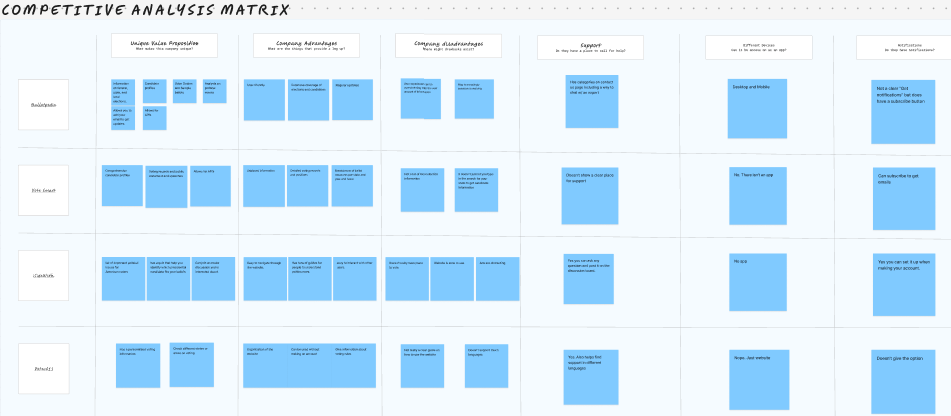
This is what the users said:

  • The majority of participants did participate in most elections while a few admitted to never or occasionally participated.
  • Most felt that voting was extremely important, but there was lack of reliable information about candidates & confusion on where to vote and when. Their top sources of information were: Government sites and News from t.v. or online.

TAKEAWAY:

  • ALL participants said they do not have an app that they used to be notified about election deadlines and information.
  • In today's fast-paced world, people rely on apps to manage their lives. An app designed to help busy users efficiently complete tasks that arise at unpredictable times can serve as a valuable and convenient tool.

Figuring out the User Needs

After synthesizing, we sorted our data into categories to better see the key functions that the user wants. We decided the Notifications Preferences would be key to DOWNLOADING the app.

organizing the data

Establishing some of the key features of the app after it was downloaded included:

Prioritization Map
  • Cliffs notes on candidate speeches
  • Notifications would include most up to date candidate information and issues relevant to their location
  • Notifications to include direct links to actions to complete
  • Include a way to notify friends and family to vote before deadlines to promote more use of the app
Journey Map

We mapped out the main areas of the JOURNEY for the user:

  • The user's excitement upon discovering the Civic Connections app after feeling unsure about when and where to vote.
  • Downloading the app
  • Setting up preferences
  • Receiving notifications

We did a User Flowchart for each of the steps to ensure logic of navigation.

2 examples being:

  • User Account Set up
  • Notification Set up
organizing the data

Our Competitive Analysis against 4 other voting sites showed:

  • Some focused on candidate information while others focused on issues.
  • Navigating to Local elections, where our users seemed to have the biggest issue, wasn’t necessarily a top priority.
  • NONE of them had a downloadable app
  • Only 1 of the sites offered notifications the others were email subscriptions which can get lost in the mix, not direct like an actual notification

TAKEAWAY:

  • With limited time to complete project, we decided to focus on the Notifications part of the app.
  • Having a downloadable app that has these types of notifications to meet voting deadlines, along with having other pertinent features in the app and it being in one place could very well increase voter turnouts across the board.

Wireframes, Usability Testing, Iterations

Our initial wireframes were minimal and lacked clear information or instructions to guide the user. As a result, iterations based on usability testing focused on:

Location/Zip Create Account the Home Page Notifications Page Reminders Page

TAKEAWAY:

  • It's important to simplify information in your design but not so much that it lacks needed information to understand next steps or expectations.
  • While there are many sources for researching voting information, simplifying the voting process through an app that personalizes preferences and provides timely notifications about key deadlines is essential for encouraging convenient civic engagement.