↑ Top
Project Summary
Lorelei Home Page
This project was a redesign of an existing non-profit website. The website was not initially made to be dynamic but we redesigned it to match desktop and mobile sizes.

Methods We Used:

Collaborators:

My Role:

Problem:

Our interviews revealed a common line of thought; The site is hard to navigate, not easy to trust at first glance, and the adoption process is extremely overwhelming.

Solution:

Our goal for this redesign:

Our Process

Inventory & Audit

This audit revealed many areas of inconsistencies in design and flow of information.
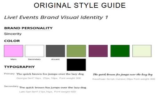
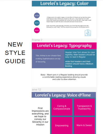
  • Uncomplimentary color variations
  • Inconsistent fonts throughout the website
  • Illogical navigation throughout website and disarranged Home Page
Inventory Image

Style Guides:

TAKEAWAY:

The color scheme, typography, the lengthy Adoption form, and call to action buttons for the donations were the focus points.

It was important to let users know key areas about website:

Convergent Thinking:

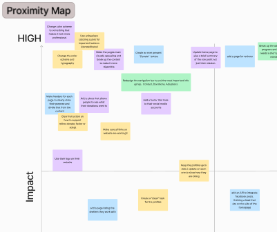
After ideating, grouping ideas and categories, we used a Prioritization Map and a User Flow to help narrow down areas of improvement and produce logical navigation. Here are some examples of areas that would provide the highest impact while being easiest to implement:

Categorizing areas to improve upon:

organizing the data
  • Change Color scheme
  • Redesign Navigation
  • Consistent Headers & Footers
  • Arrange information flow
  • Update the Adoption Form

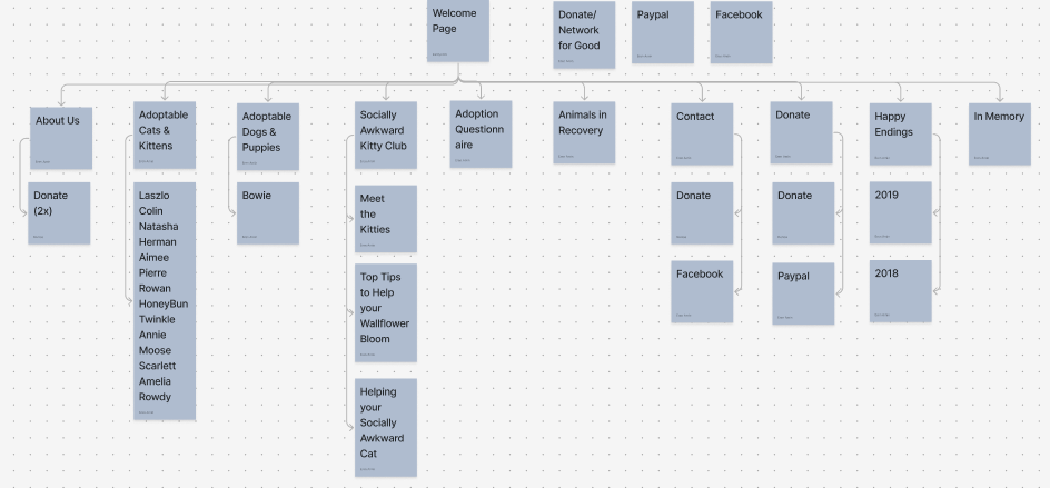
We mapped out User Flow to improve navigation and help with next steps of wireframing:

  • Established consistent navigation bar and footer
  • Separated previous consolidated categories so that there is more awareness of those categories
  • Ensure CTA(Donate) button was visible and in more key areas
organizing the data

TAKEAWAY:

  • It was clear this website was outdated and could use a fresh coat of paint for a quick refresh. That was one piece of it.
  • The other pieces to update the website would take more time. Adding a donate button to more places, figuring out the best way to get users to complete Adoption Form and producing a logical navigation were our challenges.

Initial Wireframes

This is part of our initial wireframing stage. We did a couple of sketches for the Home page and one for the Donation Page.

Lorelei's Initial Wireframes

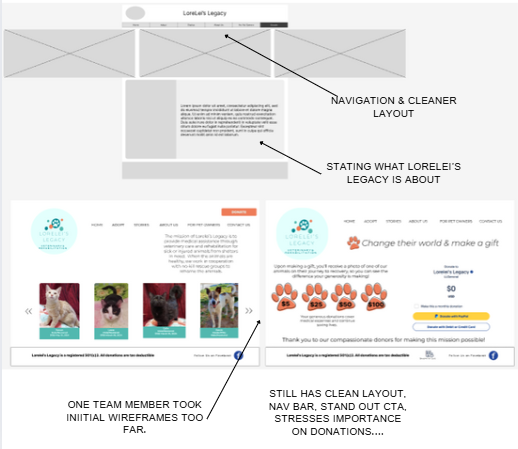
Next we have a couple of wireframes with a consistent Navigation bar, a place for cute images and more detailed information about Lorelei's Legacy.

Lorelei's MidFid Wireframes

Wireframes & A/B Testing

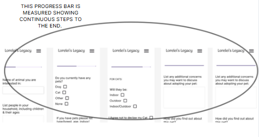
The A/B test was done on the Adoption form. It was important to find out which way users would be more likely to complete the adoption form. Both tests had a progress bar but the difference was that one had text, the other didn't.

A Test: Had text highligting the current part of the form and offering the text header to the next page of form with arrows indicating there is another page.

Progress with Text
  • 7 users participated:
    Average time on task: 2 minutes 26 seconds.
    Page 1 - averaged 32.3 seconds with 13 clicks
    47.5 average clicks per page overall.

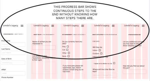
B Test: Showed no text but had a bar that was partially highlighted so a user could see where they were in the process of filling out form.

Progress with a Bar
  • 8 users participated:
    Average time on task: 8 minutes 24 seconds.
    Page 1 - averaged 17 seconds with 14.33 clicks
    25 average clicks per page overall.

TAKEAWAY:

  • The A/B test results were close letting us know it would be beneficial to conduct a ton more user tests to be more difinitive about results.
  • We felt the progress bar showing the progress fared better with this pool of users at this point.

Comparing Original and New Designs

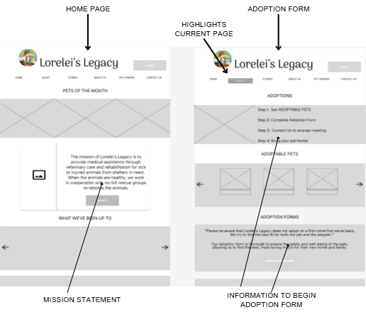
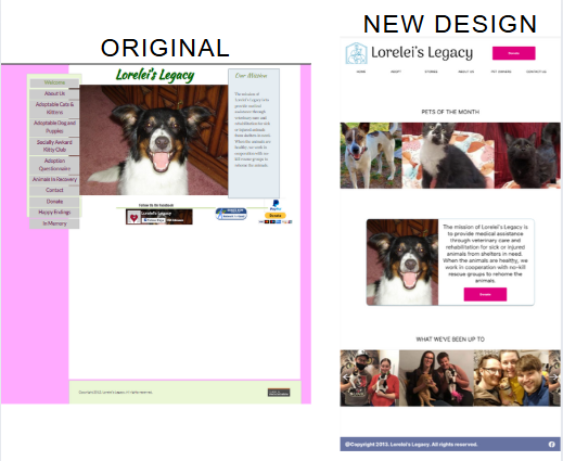
This is the HOME PAGE side by side.
We added the navigation bar, the colors are sociable, playful, tranquil with highlighting the Donate button here and consistently throughout website.

organizing the data

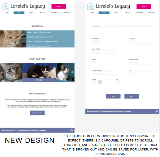
This is the ADOPTION HOME page.
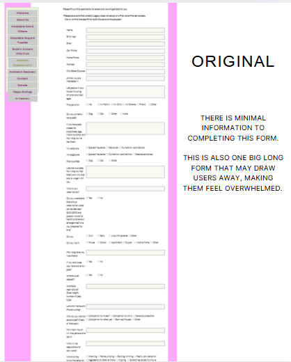
The one one the left is the original format to completing the adoption form.
The one on the right is the Adoption form Home page and the first page after clicking on the Adoption Form button at the bottom.

Old Adoption Form
New Adoption Form

TAKEAWAY:

  • By having an Adoption Home page full of information like the steps to take, pictures of animals to adopt, and then finally, a space to decide to click the Adoption Form button, can make a user feel ready to begin the process.
  • Breaking the form into sections and categories can lessen the feeling of being overwhelmed. Filling out a section and completing it makes a user feel accomplished.